Your Website Does Not Need to Bench Press 200MB
Fancy websites are wonderful — wasteful ones are not. On speed as part of the design, seasoning versus substance, and why the goal is to build weird and ship light.
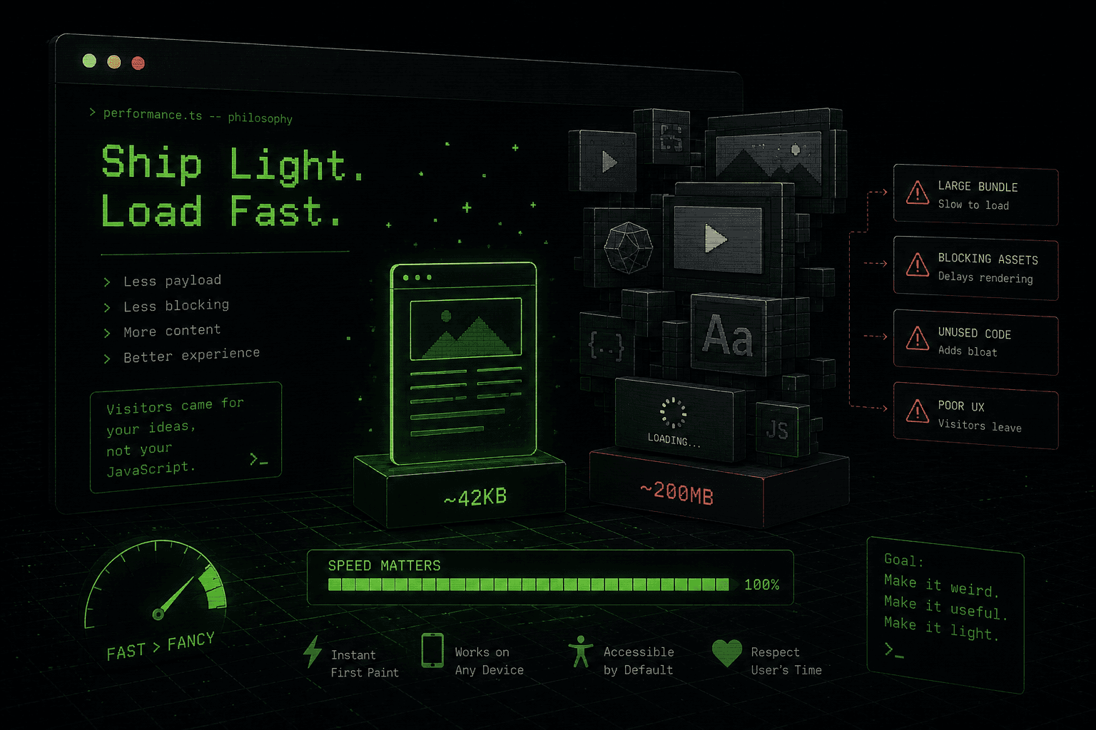
The internet has developed a tiny problem.
Somewhere along the way, we decided every website needed to arrive like it was making an entrance at the Met Gala.
Huge videos.
Seven fonts.
Animations inside animations.
A loading screen for the loading screen.
A 3D object spinning in the corner because apparently the corner was feeling lonely.
Very cool.
But I came here to read three paragraphs.
Your website is not a Marvel movie.#
There is nothing wrong with making a website beautiful.
Actually, please do.
Give it personality. Make it weird. Make it elegant. Make it look like a forgotten computer terminal from 1987. Put a dancing pixel banana in the footer. I support your artistic journey.
But every visual decision should earn its rent.
If a 14MB animation exists only to make a heading float upward by twelve pixels, we may have lost the plot.
A website still has one extremely important job:
Do the thing the visitor came here to do.
Everything else is seasoning.
And nobody wants to eat a bowl of seasoning.
Fast is a feature.#
People talk about performance like it is boring developer housekeeping.
It isn’t.
A fast website feels good.
Click.
Boom.
There it is.
No dramatic spinner. No mysterious blank rectangle. No moment where you wonder whether your Wi-Fi has entered another dimension.
Speed is part of the design.
When a page responds immediately, the whole experience feels sharper, more intentional and, ironically, more premium.
Your visitors should be exploring your website, not watching it assemble itself.
Simple does not mean boring.#
This is where minimalism gets misunderstood.
A simple website does not have to be a white background, black Helvetica, three links and the personality of an office printer.
Simple means the important stuff is obvious.
You can have textures.
You can have illustrations.
You can have ridiculous typography.
You can have CRT effects, grain, stickers, neon arrows, pixel art, funky transitions and a cursor that looks like it escaped from Windows 95.
Go wild.
Just don’t make the visitor solve an escape room to find the About page.
Visual chaos can be an aesthetic. Functional chaos should not be.
Nobody asked for seventeen libraries.#
Modern web development occasionally feels like ordering a sandwich and receiving the entire restaurant.
You wanted a menu animation.
Now there are dependencies.
Those dependencies have dependencies.
One of those dependencies hasn’t been updated since 2021.
Nobody remembers why another one exists.
And somehow we downloaded enough JavaScript to operate a small satellite.
Sometimes you need the fancy tools. Great.
Sometimes you need twelve lines of CSS.
Also great.
Use the smallest hammer that actually hits the nail.
The best interface is the one people understand.#
Visitors should not need a tutorial.
They should know what is clickable.
They should be able to read the text.
They should be able to use the site on a phone without performing finger gymnastics.
They should be able to navigate with a keyboard.
And your beautiful experimental masterpiece should not completely collapse because somebody has a smaller screen, slower connection or different browser.
Accessibility isn’t the boring part you sprinkle on later.
It is good design doing its job properly.
Content is still the main character.#
A shocking development, I know.
People visit websites for something.
An idea.
A story.
A product.
A person.
A tool.
An answer.
A suspiciously good portfolio.
Design should make that thing more interesting, easier to understand or more memorable.
If the design becomes so loud that nobody remembers what the website actually said, congratulations:
You have created a very expensive screensaver.
But wait. This website has animations.#
Correct.
You caught me.
Look around.
This site has graphics. It has motion. It has style. It probably contains at least one completely unnecessary thing that I added because it looked cool.
And that is perfectly fine.
The point is not:
“Never make fancy websites.”
That would be painfully boring.
The point is:
“Make fancy websites on purpose.”
Optimize the images.
Compress the assets.
Animate the things worth animating.
Respect reduced-motion settings.
Load what you actually need.
Keep the text readable.
Make the navigation obvious.
Give every little piece of chaos a reason to exist.
Build weird. Ship light.#
The web is one of the few places where a page can look like a newspaper from 1924, an arcade machine from 1983 and a spaceship control panel from 2087, all at the same time.
We should absolutely have fun with that.
The answer isn’t to remove personality.
The answer is to remove waste.
Keep the funky.
Keep the vintage.
Keep the strange little animation you’re way too emotionally attached to.
Just don’t make somebody download half the internet to see it.
A great website doesn’t need to prove how complicated it was to build.
It just needs to work.
And if it works and looks ridiculously cool?
Now we’re cooking.